Air Similan unveils new visual identity and modernized livery
Paris, October 25, 2024 – Since its founding in 2020, Air Similan has cultivated a strong brand identity. In keeping with its commitment to innovation and excellence, the virtual airline announces today a refreshed visual identity to better meet the demands of the modern digital landscape.
An evolving color palette
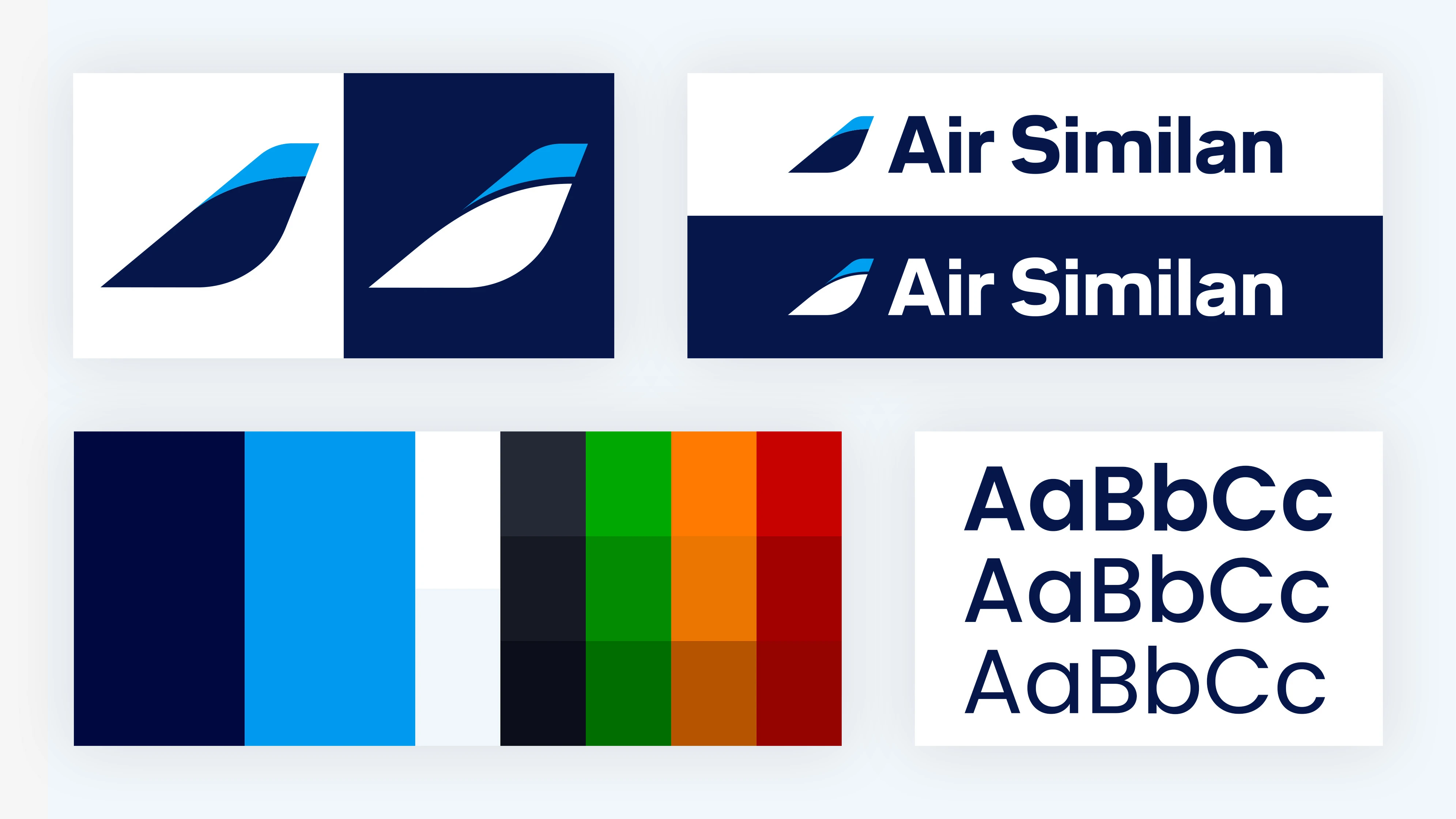
Historically centered around two iconic shades—navy blue and sky blue—paired with white, Air Similan's color palette has long embodied its core values. Navy blue symbolizes stability and trust, while sky blue conveys openness and innovation; together, they have defined the airline’s essence, with white signifying purity and clarity.
To meet 21st-century expectations and enhance its digital presence, Air Similan has enriched its color scheme with new shades. A light gray has been added for added visual depth, and three dark gray tones have been introduced to organize information and improve readability across digital interfaces.
Shades of green, orange, and red complete this updated palette, enabling visual coding of successes, warnings, and errors. This visual approach facilitates clearer, more effective communication, both internally and externally.
A revitalized logo
The Air Similan logo has also been refreshed. Simplified with clean lines, the updated logo text strengthens the company’s brand image. The aircraft tail, an iconic symbol introduced in 2020, has been redesigned to appear more dynamic and elegant, aligning seamlessly with the new visual identity.
A new livery for a new era
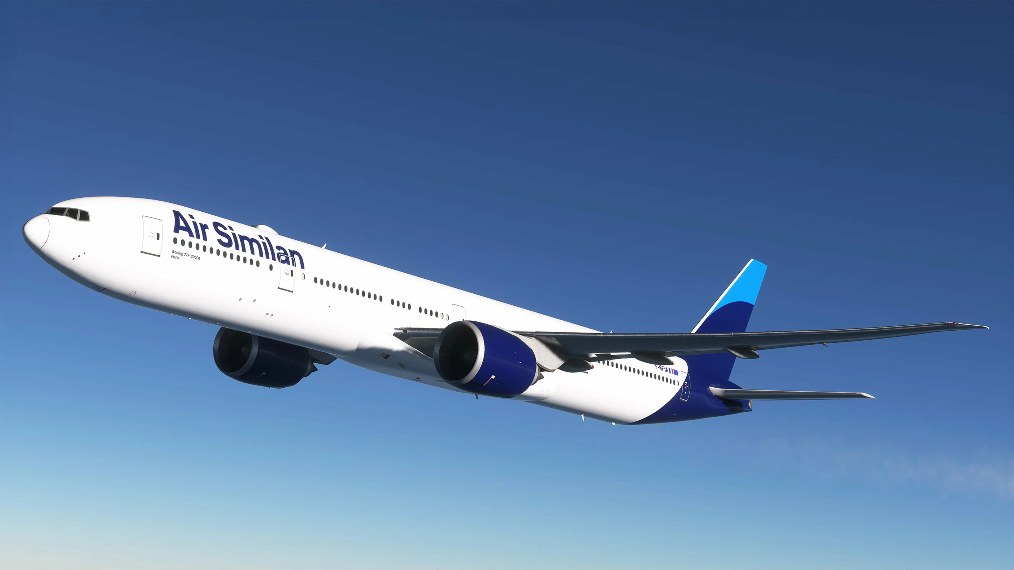
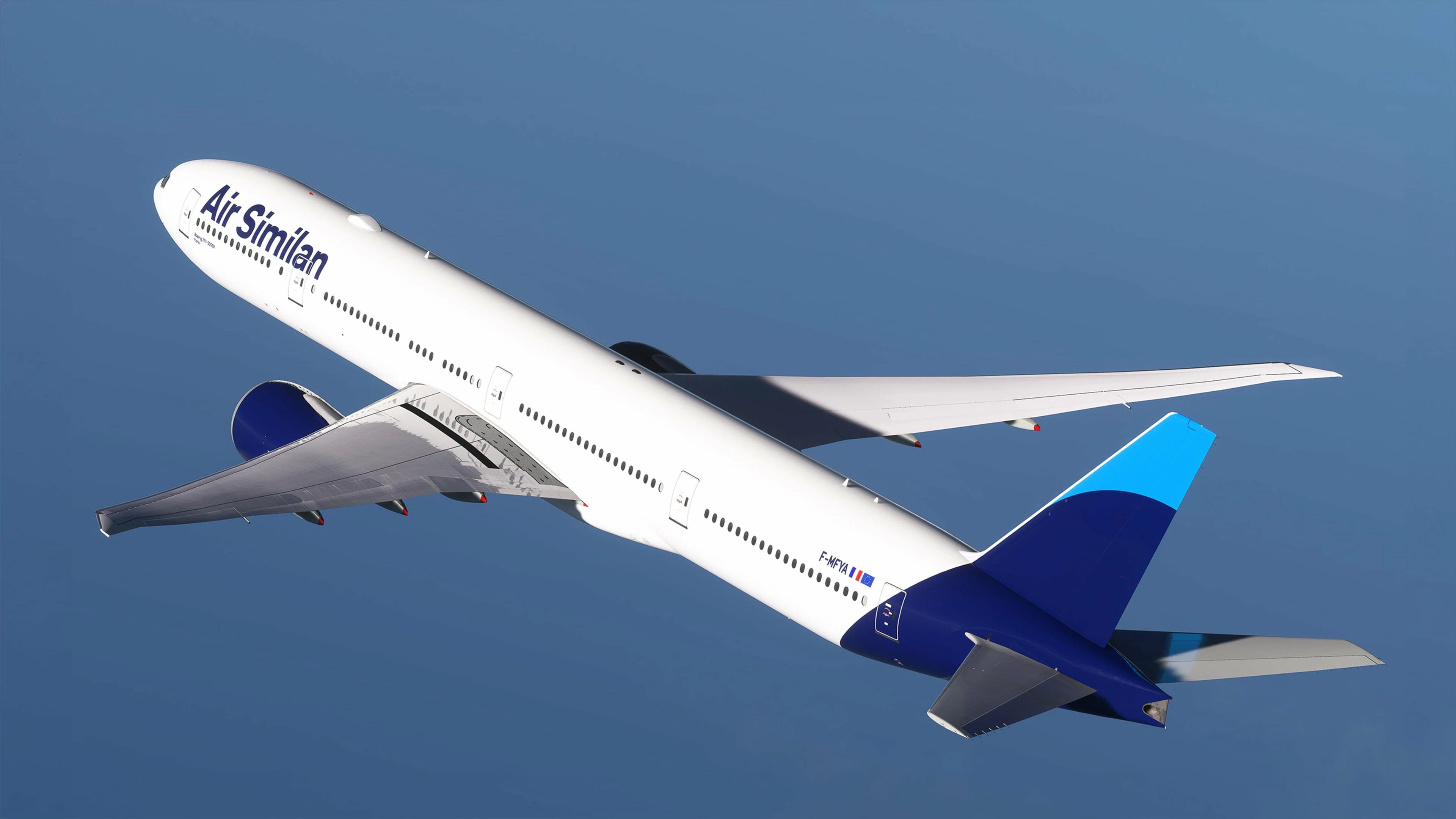
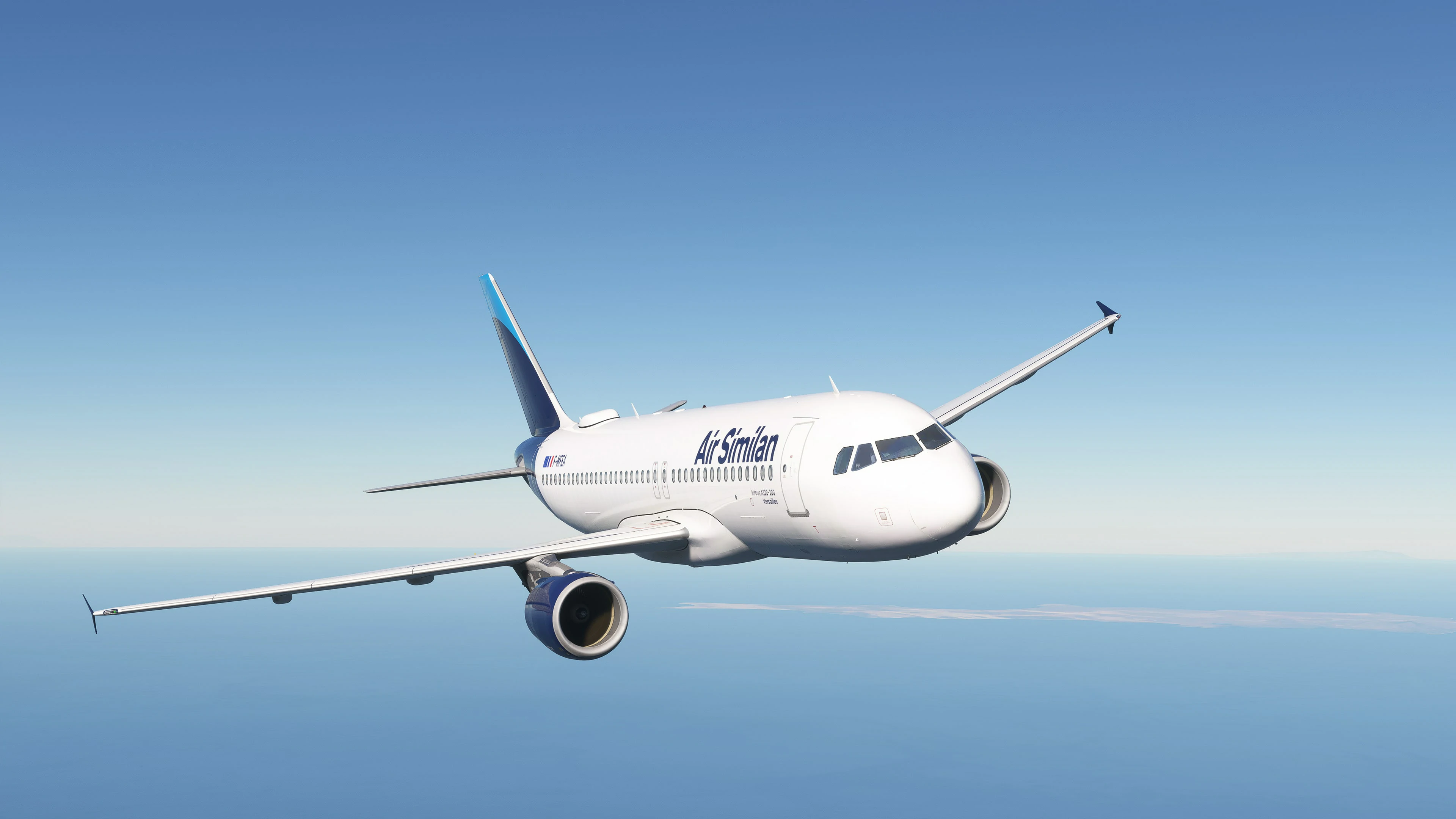
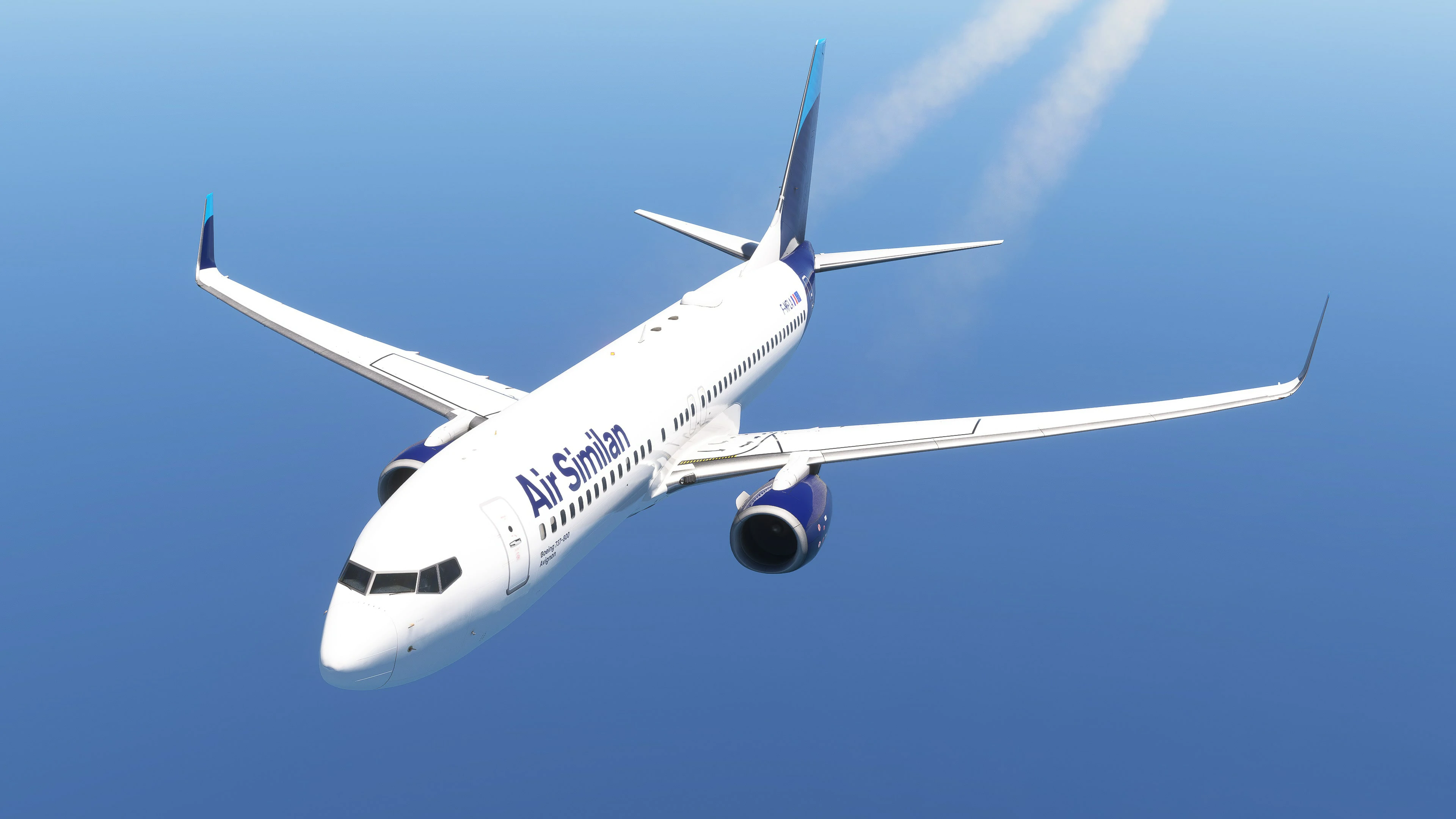
The aircraft livery—the brand’s flying showcase—has likewise been updated. Elegant, modern, and refined, it perfectly embodies the airline’s spirit. The previous livery, unveiled in 2020, became a recognizable and admired symbol, but an evolution was necessary to reflect the new visual identity.
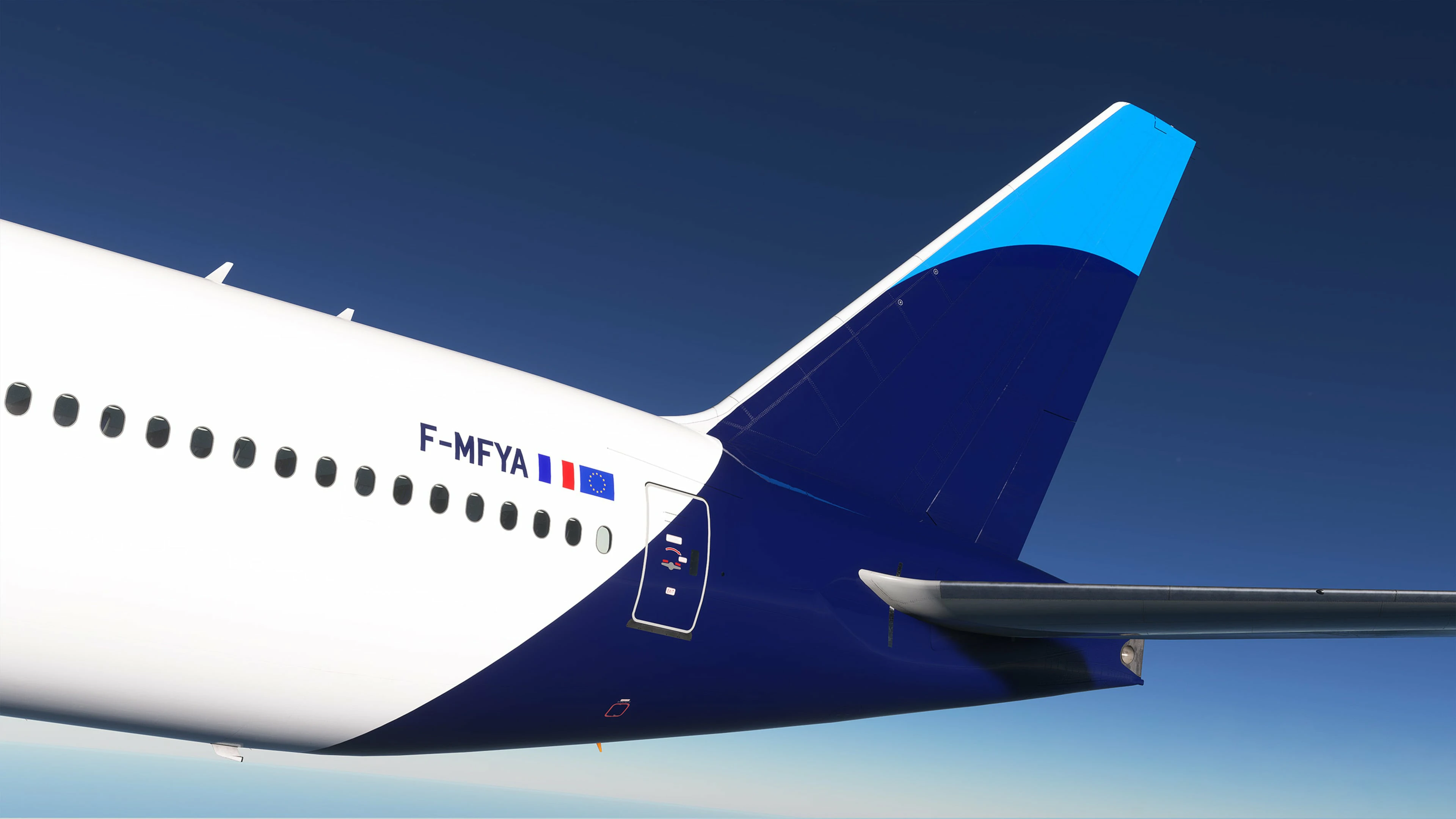
The aircraft fuselage now proudly displays the new Air Similan logo, while the signature navy blue engines provide a striking contrast against the white fuselage, highlighting the brand’s legacy. The tail, central to the livery, has been redesigned to be even sleeker, featuring a line that extends smoothly down the tail, with navy blue continuing along the aircraft’s aft section, reinforcing the brand’s visual identity and continuity. The sky blue accent on the top of the tail is retained, adding a touch of freshness and innovation.
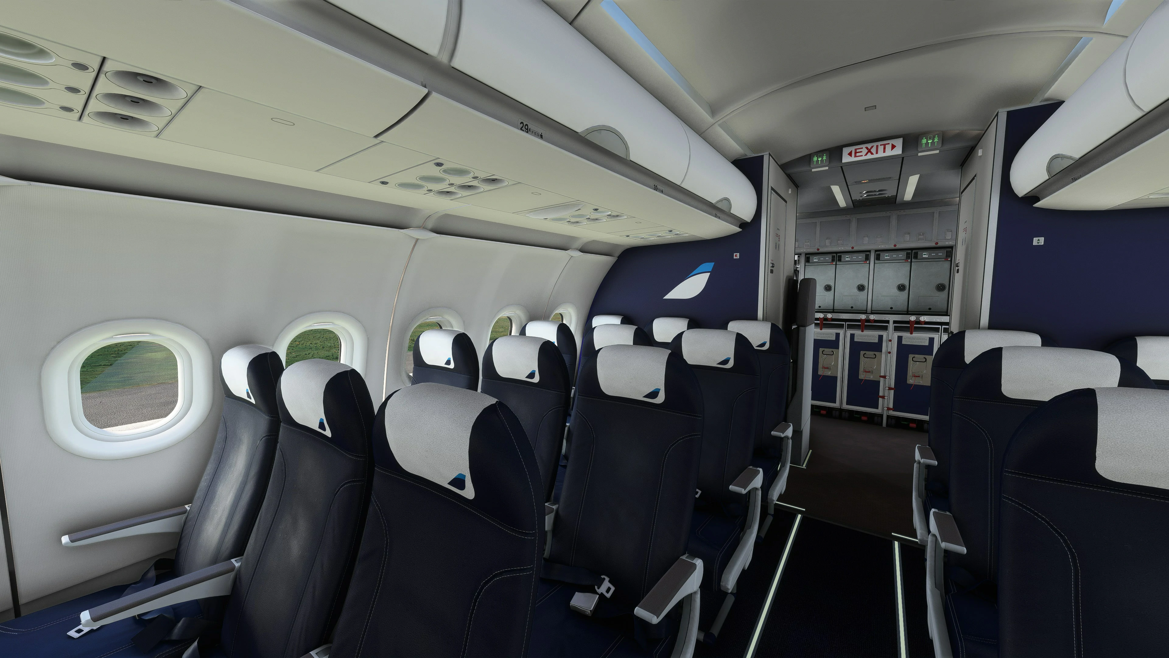
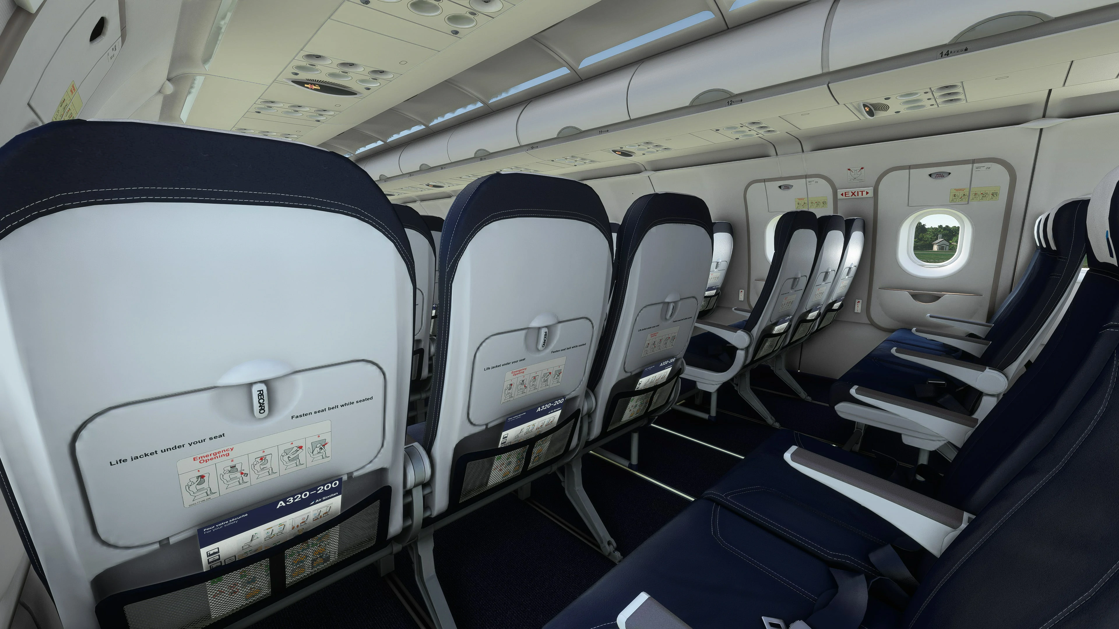
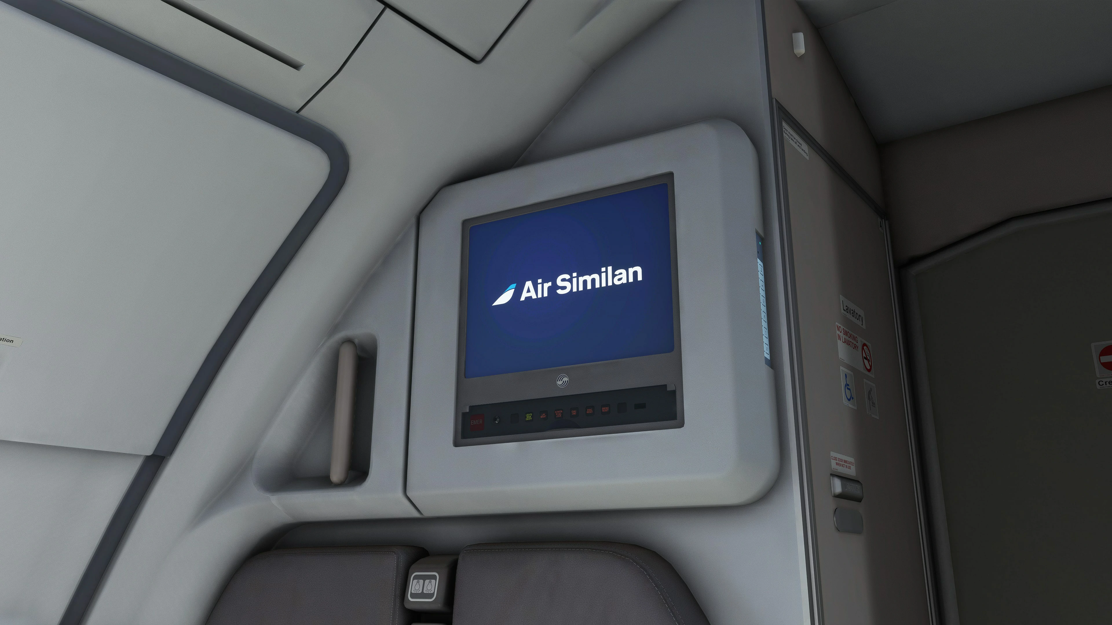
The modernization of the visual identity and livery also includes a redesign of our cabin interiors.
An identity reflecting commitment
This modernization is more than a mere aesthetic update. It embodies Air Similan’s dedication to innovation, excellence, and staying true to its identity. The updated visual identity and modernized livery reinforce the airline’s presence in the flight simulation world, ready to continue impressing and inspiring not only in the virtual realm but also in the hearts of aviation enthusiasts everywhere.